Designing a Serene Bedroom with Art and Textiles
Designing a serene bedroom is less about perfection and more about creating a space that quietly supports rest, reflection, and comfort. Art and textiles are the two most powerful tools for shaping that mood: they control what you see first and what you feel most. When you use them thoughtfully, the room becomes a soft landing at the end of every day.
Start with a Calm Visual Story
Before choosing objects, decide how you want the room to feel: airy and light, cocoon-like and cozy, minimal and quiet, or romantic and layered. Let that emotional “headline” guide every choice in art and textiles.
Pick a simple palette of 2–3 main colors plus 1–2 soft accents. Serene bedrooms usually lean on:
- Soft neutrals (warm white, oatmeal, greige, sand, mushroom)
- Dusty tones (sage green, slate blue, mauve, clay, stormy gray-blue)
- Gentle contrast instead of high contrast (e.g., stone and cream vs. black and white)
Art and textiles should sit in the same color family or share undertones. That cohesion is what keeps the eye calm rather than jumping from one object to another.
Using Art as a Mood Anchor
Art is the emotional focal point of the room. It doesn’t have to be expensive or large, but it should feel peaceful and personal.
1. Choose soothing subjects
Look for pieces that invite you to breathe more slowly:
- Abstracts with soft edges and blurred transitions
- Landscapes: misty forests, horizon lines, quiet fields, seascapes
- Minimal line drawings with generous negative space
- Organic forms: botanicals, branches, stones, clouds
Avoid visuals that feel chaotic: harsh geometry, loud neon colors, aggressive or heavily narrative pieces that demand attention.
2. Control color and contrast
Even a calm subject can feel busy if the contrast is extreme. For serenity:
- Prefer muted or slightly desaturated colors
- Keep the darkest tones to small areas rather than big blocks
- Match the dominant colors in your art to your textiles (for example, echo the blues of a seascape in your throw pillows or quilt stitching)
Think of the art as the “face” of the bedroom; textiles become the “voice” that quietly repeats the same story.
3. Placement and scale
Where you place art matters as much as what you choose.
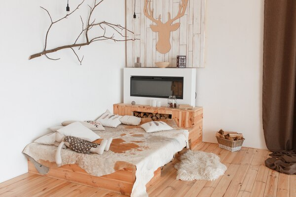
- Over the headboard:
- One large horizontal piece that spans about 60–75% of bed width, or
- A simple diptych/triptych with consistent frames and spacing
- Opposite the bed: something you’ll be content to see first thing in the morning and last thing at night
- Beside the bed: small works at eye level when standing, not too low or scattered
Leave enough blank wall around each piece. Negative space is part of the calm.
4. Frames and materials
Keep frames simple:
- Thin wood (oak, birch, walnut) or slim metal (white, soft black, brass)
- Matte rather than high-gloss finishes
- White or off-white mats for photographs and prints
Avoid heavy ornament, thick shiny moldings, or many conflicting frame styles in a single small room.
Textiles: Building Tactile Calm
If art sets the tone for your eyes, textiles set it for your body. They are the path from “I like how this looks” to “I want to lie down here right now.”
1. Choose gentle, breathable materials
Focus on touch:
- Cotton percale or sateen for sheets
- Linen for a relaxed, slightly textured look that breathes well
- Cotton or wool throws for seasonal layering
- A soft, low- or mid-pile rug beside or under the bed
Natural or natural-feeling fibers usually help the mind and body relax better than very synthetic, shiny materials.
2. Layer thoughtfully, not excessively
Serene does not mean bare; it means intentional.
- Base layer: fitted sheet + flat sheet or just a fitted sheet if you prefer minimal bedding
- Middle layer: lightweight quilt, coverlet, or duvet
- Top layer: one throw at the foot of the bed for visual weight and seasonal warmth
- Pillows:
- 2 sleeping pillows
- 2–3 larger shams or cushions for structure
- 1 small accent pillow if you want a focal color or pattern
Stop layering the moment the bed looks inviting rather than styled for a photo. Over-decorated beds can feel like a chore to get into.
3. Calm patterns and subtle texture
Use pattern sparingly, and let texture do most of the visual work.
- Gentle patterns: thin stripes, fine checks, small-scale florals, soft abstract washes
- Textures: quilted stitching, stonewashed finishes, waffle weave, slubbed linen, knitted throws
To keep serenity:
- Combine one patterned main textile (for example, duvet cover) with mostly solid supporting fabrics
- Repeat similar textures in small doses: a woven throw that echoes the rug, or cushion fabric that mirrors the curtain’s linen look
Color Strategy for Textiles
Textiles occupy a large area: bedding, curtains, rug, cushions. Their color harmony is crucial.
- Use your lightest tones for the largest areas: sheets, duvet, curtains
- Introduce slightly deeper tones in the rug and throw
- Save your darkest shade or accent color for minimal use: a single cushion, stitched edging, or a narrow stripe
This gradient from light to medium has a soft, horizon-like effect that feels tranquil.
Curtains: Softening Light and Edges
Light can make or break serenity. Curtains and shades not only control brightness but also soften lines and acoustics.
- Use floor-length curtains if possible; they stretch the room vertically and feel more finished
- Choose semi-sheer for daytime softness plus a separate blackout layer (lining or roller shade) for sleep
- Match or slightly contrast curtains with walls (e.g., warm white curtains on pale greige walls; oatmeal linen on white walls)
Avoid overly stiff or shiny fabrics. A slight movement in the fabric when air flows through the room adds to the calming effect.
Rugs: Grounding the Space
Stepping out of bed onto something soft is a powerful comfort cue.
- Size: ideally large enough that the bed sits partially on the rug with generous space on both sides, or use two runners on each side
- Color: keep it within your room palette, with one or two gentle tones rather than complex multicolored patterns
- Texture: low- to medium-pile, flatweave, or wool blends. Aim for “soft underfoot, quiet to the eye.”
If the floor is already visually busy (like strong wood grain or patterned tiles), pick very simple rugs that calm rather than compete.
Creating Harmony Between Art and Textiles
Think of your room as a conversation between wall and fabric.
- Echo colors: pull one or two minor colors from your art into a pillow, throw, or rug
- Repeat shapes: if your art features soft curves, choose rounded pillows, a curved headboard, or circular side tables instead of only sharp corners
- Balance weight: a bold or larger piece of art over the bed pairs well with quieter, more tonal textiles; very subtle art can handle slightly richer textures or pattern in bedding
Avoid matching exactly; aim to “rhythmically echo” instead of copy-paste.
Managing Visual Noise
Serenity is often about what you remove or hide.
- Limit the number of competing focal points: ideally one major focal area (often the bed wall) and one mild secondary point (like a styled dresser or chair)
- Tidy surfaces: keep nightstands clear except for a light, a book, and maybe one small tray or decorative object
- Conceal clutter: use baskets, closed drawers, lidded boxes, and under-bed storage to keep visual chaos out of sight
Even beautiful textiles lose their impact if surrounded by cords, piles, and miscellaneous objects.
Light, Mood, and Reflection
Art and textiles behave differently under light. Plan for layers of lighting:
- Soft ambient light (ceiling fixture with warm bulb or diffused shade)
- Low, warm bedside lamps or sconces for evenings
- Optional small accent light—like a wall washer on a favorite art piece—to create a calm focal glow
Choose warm-white bulbs (around 2700–3000K) to avoid a clinical feel. Watch how daylight shifts across your artwork and fabrics; if something feels jarring at certain times of day, consider repositioning it.
Personal Details Without Clutter
Serenity doesn’t mean anonymity. Include a small number of deeply personal but quiet items:
- A framed photograph in black and white or muted color
- A small ceramic bowl or sculpture on a nightstand or dresser
- A favorite textile—like a handwoven throw or a vintage quilt—used with intention, not buried under other patterns
Let each meaningful object “breathe” with space around it. This gives it more presence and keeps the room restful.
Adapting to Different Styles
You can apply these principles to many aesthetics without losing calm:
- Minimal: few large-scale pieces of art, nearly solid textiles, very limited color palette
- Scandinavian: light woods, white and beige textiles, simple graphic art, subtle pattern in rugs
- Modern coastal: sea- and sand-inspired palette, abstract or landscape art, airy linen curtains, striped or textured throws
- Soft bohemian: layered textiles in a controlled palette, organic art, handmade ceramics, woven wall pieces—but strict editing to avoid visual overload
Regardless of style, serenity comes from consistency, restraint, and comfort-focused decisions.
A serene bedroom built around art and textiles is not about showmanship; it is about subtle coordination and sensory ease. Choose art that allows your mind to settle, textiles that your body wants to sink into, and a palette that gently repeats itself across surfaces. When your eyes, hands, and breath all relax in the same space, you know the room is working.